# BackgroundLibrary
**Repository Path**: andlin/BackgroundLibrary
## Basic Information
- **Project Name**: BackgroundLibrary
- **Description**: No description available
- **Primary Language**: Unknown
- **License**: Apache-2.0
- **Default Branch**: master
- **Homepage**: None
- **GVP Project**: No
## Statistics
- **Stars**: 0
- **Forks**: 0
- **Created**: 2021-10-18
- **Last Updated**: 2024-09-04
## Categories & Tags
**Categories**: Uncategorized
**Tags**: None
## README
# BackgroudLibrary
A framework for directly generating shape through Tags, no need to write shape.xml again(通过标签直接生成shape,无需再写shape.xml)

Add this to your app's build.gradle:
allprojects {
repositories {
...
maven { url 'https://jitpack.io' }
}
}
implementation "androidx.appcompat:appcompat:$supportVersion"
implementation 'com.github.JavaNoober.BackgroundLibrary:library:1.7.6'
if use androidx:
allprojects {
repositories {
...
maven { url 'https://jitpack.io' }
}
}
implementation "androidx.appcompat:appcompat:$supportVersion"
implementation 'com.github.JavaNoober.BackgroundLibrary:libraryx:1.7.6'
## Example effect
show more in [wiki](https://github.com/JavaNoober/BackgroundLibrary/wiki)

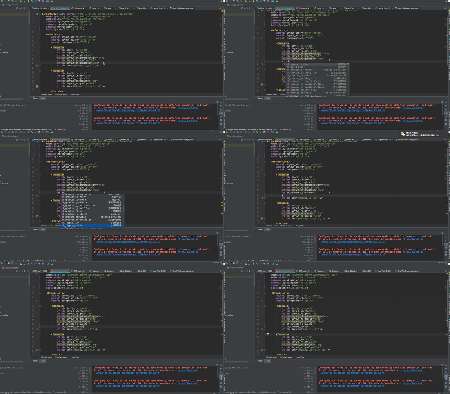
Automatic code prompt by Live Templates
## How to use
1、before version 1.5.0, Calling code before the 'super.onCreate' in BaseActivity, after 1.5.0 no need more
BackgroundLibrary.inject(context);
2、Add the attributes directly in the layout
[Blog introduction](https://github.com/JavaNoober/BackgroundLibrary/blob/master/%E4%BD%BF%E7%94%A8%E4%BB%8B%E7%BB%8D.md)
## Custom attributes supported
The following are all custom attributes that are exactly the same as shape and selector.
### shape
All attributes of shape are supported. The naming rule is **'tag name'_'tag attribute name'**:
| name | category |
|---|---|
|bl_shape|rectangle、oval、line、ring(not support yet)|
|bl_solid_color|color|
|bl_corners_radius|dimension|
|bl_corners_bottomLeftRadius|dimension|
|bl_corners_bottomRightRadius|dimension|
|bl_corners_topLeftRadius|dimension|
|bl_corners_topRightRadius|dimension|
|bl_gradient_angle|integer|
|bl_gradient_centerX|float|
|bl_gradient_centerY|float|
|bl_gradient_centerColor|color|
|bl_gradient_endColor|color|
|bl_gradient_startColor|color|
|bl_gradient_gradientRadius|dimension|
|bl_gradient_type|linear、radial、sweep|
|bl_gradient_useLevel|boolean|
|bl_size_width|dimension|
|bl_size_height|dimension|
|bl_stroke_width|dimension|
|bl_stroke_color|color|
|bl_stroke_dashWidth|dimension|
|bl_stroke_dashGap|dimension|
|bl_position|left、right、top、bottom|
### selector
All attributes of selector are supported:
| name | category |
|---|---|
|bl_checkable_drawable|color、reference|
|bl_checked_drawable|color、reference|
|bl_enabled_drawable|color、reference|
|bl_selected_drawable|color、reference|
|bl_pressed_drawable|color、reference|
|bl_focused_drawable|color、reference|
|bl_focused_hovered|color、reference|
|bl_focused_activated|color、reference|
|bl_unCheckable_drawable|color、reference|
|bl_unChecked_drawable|color、reference|
|bl_unEnabled_drawable|color、reference|
|bl_unSelected_drawable|color、reference|
|bl_unPressed_drawable|color、reference|
|bl_unFocused_drawable|color、reference|
|bl_unFocused_hovered|color、reference|
|bl_unFocused_activated|color、reference|
|setting about textColor||
|bl_checkable_textColor|color|
|bl_checked_textColor|color|
|bl_enabled_textColor|color|
|bl_selected_textColor|color|
|bl_pressed_textColor|color|
|bl_focused_textColor|color|
|bl_activated_textColor|color|
|bl_active_textColor|color|
|bl_expanded_textColor|color|
|bl_unCheckable_textColor|color|
|bl_unChecked_textColor|color|
|bl_unEnabled_textColor|color|
|bl_unSelected_textColor|color|
|bl_unPressed_textColor|color|
|bl_unFocused_textColor|color|
|bl_unActivated_textColor|color|
|bl_unActive_textColor|color|
|bl_unExpanded_textColor|color|
|setting about buttonDrawable||
|bl_checked_button_drawable|color、reference|
|bl_unChecked_button_drawable|color、reference|
|bl_multi_text_selector1| String| |
|bl_multi_text_selector2| String| 同上|
|bl_multi_text_selector3| String| 同上|
|bl_multi_text_selector4| String| 同上|
|bl_multi_text_selector5| String| 同上|
|bl_multi_text_selector6| String| 同上|
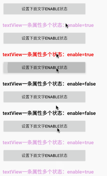
bl_multi_text_selector的使用方法:
支持selector的一条属性设置同时设置多个状态的写法,内容规则为以",
"为分隔符,最后一项为颜色资源id的名字,可选状态为state_checkable,state_checked,state_enabled,state_selected,state_pressed,state_focused,state_hovered
,state_activated,默认为true,如果为false则在前面加上"-"即可,例如-state_checkable
效果例子如下:
### attributes about anim:
| 名称 | 类型 |
|---|---|
|bl_oneshot|only show once|
|bl_anim_auto_start| auto start|
|bl_duration|The length of each animation frame|
|bl_duration_item0|The animation duration of frame 0|
|bl_duration_item1|The animation duration of frame 1|
|bl_duration_item2|The animation duration of frame 2|
|bl_duration_item3|The animation duration of frame 3|
|.|.|
|.|.|
|.|.|
|bl_duration_item12|The animation duration of frame 12|
|bl_duration_item13|The animation duration of frame 13|
|bl_duration_item14|The animation duration of frame 14|
|bl_frame_drawable_item0|Frame 0 animation|
|bl_frame_drawable_item1|Frame 1 animation|
|bl_frame_drawable_item2|Frame 2 animation|
|bl_frame_drawable_item3|Frame 3 animation|
|.|.|
|.|.|
|.|.|
|bl_frame_drawable_item12|Frame 12 animation|
|bl_frame_drawable_item13|Frame 13 animation|
|bl_frame_drawable_item14|Frame 14 animation|
### other(need sdk 27 and above)
| name | category |remark|
|---|---|---|
|bl_ripple_enable|boolean|ensure that the ripple effect is enabled|
|bl_ripple_color|color|the color of ripple|
|bl_checkable_stroke_color| color| different color when different state for stroke,need api > 21,default stroke_color|
|bl_checked_stroke_color| color| |
|bl_enabled_stroke_color| color| |
|bl_selected_stroke_color| color| |
|bl_pressed_stroke_color| color| |
|bl_focused_stroke_color| color| |
|bl_unCheckable_stroke_color| color| |
|bl_unChecked_stroke_color| color| |
|bl_unEnabled_stroke_color| color| |
|bl_unSelected_stroke_color| color| |
|bl_unPressed_stroke_color| color| |
|bl_unFocused_stroke_color| color| |
|bl_checkable_solid_color| color| different color when different state for solid,need api > 21,default solid_color|
|bl_checked_solid_color| color| |
|bl_enabled_solid_color| color| |
|bl_selected_solid_color| color| |
|bl_pressed_solid_color| color| |
|bl_focused_solid_color| color| |
|bl_unCheckable_solid_color| color| |
|bl_unChecked_solid_color| color| |
|bl_unEnabled_solid_color| color| |
|bl_unSelected_solid_color| color| |
|bl_unPressed_solid_color| color| |
|bl_unFocused_solid_color| color| |
### generate drawable by code(above v1.3.0)
detail see :[DrawableCreator.Build](https://github.com/JavaNoober/BackgroundLibrary/blob/develop/library/src/main/java/com/noober/background/drawable/DrawableCreator.java)
example:
//设置button圆角背景
Drawable drawable = new DrawableCreator.Builder().setCornersRadius(dip2px(20))
.setGradientAngle(0).setGradientColor(Color.parseColor("#63B8FF"), Color.parseColor("#4F94CD")).build();
btn.setBackground(drawable);
//文字点击变色
tvTest1.setClickable(true);//由于Android源码的原因,必须调用,否则不生效
ColorStateList colors = new DrawableCreator.Builder().setPressedTextColor(Color.RED).setUnPressedTextColor(Color.BLUE).buildTextColor();
tvTest1.setTextColor(colors);
### bl_multi_selector属性
| 名称 | 类型 |备注|
|---|---|---|
|bl_multi_selector1| String| |
|bl_multi_selector2| String| 同上|
|bl_multi_selector3| String| 同上|
|bl_multi_selector4| String| 同上|
|bl_multi_selector5| String| 同上|
|bl_multi_selector6| String| 同上|
Supports the selector for a property setting that sets multiple states at the same time. The content rules split with ",
"For the delimiter, the last item is the name of the drawable resource id, and the optional states are state_checkable, state_checked, state_enabled, state_selected, state_pressed, state_focused, state_hointernet
, the default value of state_activated is true, and "-" after false can be activated, such as -state_checkable
bl_multi_selector使用示例:
In the next example, test_sel1, the item that has android:state_pressed="true" android:state_focused="true", then bl_multi_selector1=" app:bl_multi_selector1="state_pressed,state_focused,test_bg_sel"
test_sel1:
bl_multi_selector:Usage, up to 6
## example
1.stroke+corner+solid
equals to
2、gradient
equals to
the effect of click

the first:
android:layout_width="20dp"
android:layout_height="20dp"
android:layout_marginTop="5dp"
app:bl_pressed_drawable="@drawable/circle_like_pressed"
app:bl_unPressed_drawable="@drawable/circle_like_normal" />
equals:
the second:
In fact, it is basically the same as shape and selector.
3.Click text discoloration

4.点击填充边框变色属性
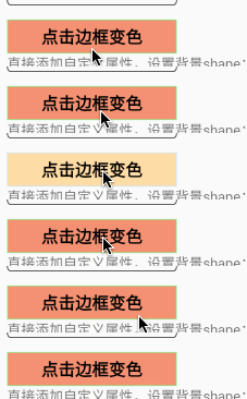
5.how to use like style
no need to add "app:"
6.set drawableLeft

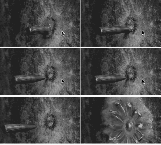
7.FrameAnimation
## ProGuard
No need to add since 1.4.3
-dontwarn com.noober.background.**
-keep public class com.noober.background.** {*;}
## Use attention
1、selector的相关属性,如果传入的drawable不是颜色的资源,会覆盖掉shape设置的属性
2、在根布局添加
tools:ignore="MissingPrefix"
可以防止报红
3、因为layoutInflater限制了只能有一个factory,如果有其他库已经使用了setFactory方法,比如换肤的库,只需要在其他库调用layoutInflater.setFactory之后调用
BackgroundLibrary.inject2(context);
这样其他的库与本库同样可以生效。
4、~~selector一个item表示多个属性,暂时无法实现,如下:~~
~~因为无法用一个属性去表示两种状态,有思路的同学可以告诉我 ~~
1.4.5以后通过bl_multi_selector,可以支持
5、fragment使用无需任何处理,其Activity调用inject即可
6、listView,recyclerView使用也无需任何处理。
如果不生效,只需要
//在调用inflate只需调用一次context,保证adapter创建View时传入的是同一个context即可
BackgroundLibrary.inject(context);
View item = LayoutInflater.from(context).inflate(xxx)
7、自定义View中调用了inflate,同listView一样处理即可
## How to preview

only need to use BLView to replace View(e.g. TextView to BLTextView, EditText to BLEditText) in layout.xml, don't use BLView in the code.
## How to use Live Templates
mac:Macintosh HD\user\xxx\Library\Preferences\AndroidStudio3.2\templates
windows:C:\Users\XXX\.AndroidStudio3.2\config\templates
copy the file [BackgroundLibrary.xml](https://github.com/JavaNoober/BackgroundLibrary/blob/master/BackgroundLibrary.xml) to this directory
effect:

Apache License
Copyright [2018] [javakepp]
Licensed under the Apache License, Version 2.0 (the "License");
you may not use this file except in compliance with the License.
You may obtain a copy of the License at
http://www.apache.org/licenses/LICENSE-2.0
Unless required by applicable law or agreed to in writing, software
distributed under the License is distributed on an "AS IS" BASIS,
WITHOUT WARRANTIES OR CONDITIONS OF ANY KIND, either express or implied.
See the License for the specific language governing permissions and
limitations under the License.